The cover design of the example of the use of text in graphic design (3)
(6) Now it looks like the title is a bit uncomfortable. Now adjust the kerning, and adjust the kerning, size, position, and font of other characters to maintain the complete and uniform effect.
Note: When the main elements in the layout are changed, all auxiliary text elements must be adjusted at the same time. This means that there are parts in the part and parts in the whole part. Pictured
(7) The font part of the text is now adjusted again, while some other minor text elements are adjusted, increased or decreased. Pictured
8) Basically it can be said to be completed here, but the current feeling is that the performance of the text is weak, and there is not enough power to express the content and feelings of the theme.
Now you need to be creative. Here, it is decided to redesign the font of the title, not to affect other text elements, increase the size, transparency, and color of the text font, and perform graphical processing to increase interest. These changes are entirely up to the designer himself. Follow your heart. Be careful not to affect the large effects and basic requirements.
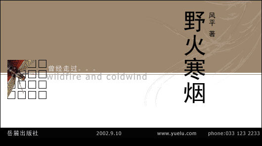
The final result is shown in the figure
The above introduces a simple process of text layout design. In practice, it is not necessary to stick to these steps because many modifications and designs are based on inspiration and intuition. At any time, you can perform some part of the work, as long as you keep the basics. The law respects the public's viewing habits.
(to be continued)
Shanghai Packaging Machinery Co., Ltd. , http://www.zjvacuumsealer.com